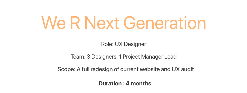
We R Next Generation is a nonprofit international organization dedicated to developing creativity and innovation in kids. Currently they hold yearly camps in Lagos, Nigeria and Washington D.C. and they hope to expand to other cities in the near future. Their educated team of teachers and volunteers is dedicated to providing children both a safe space to express their ideas freely and the tools and habits to make their dreams into reality.
The Problem
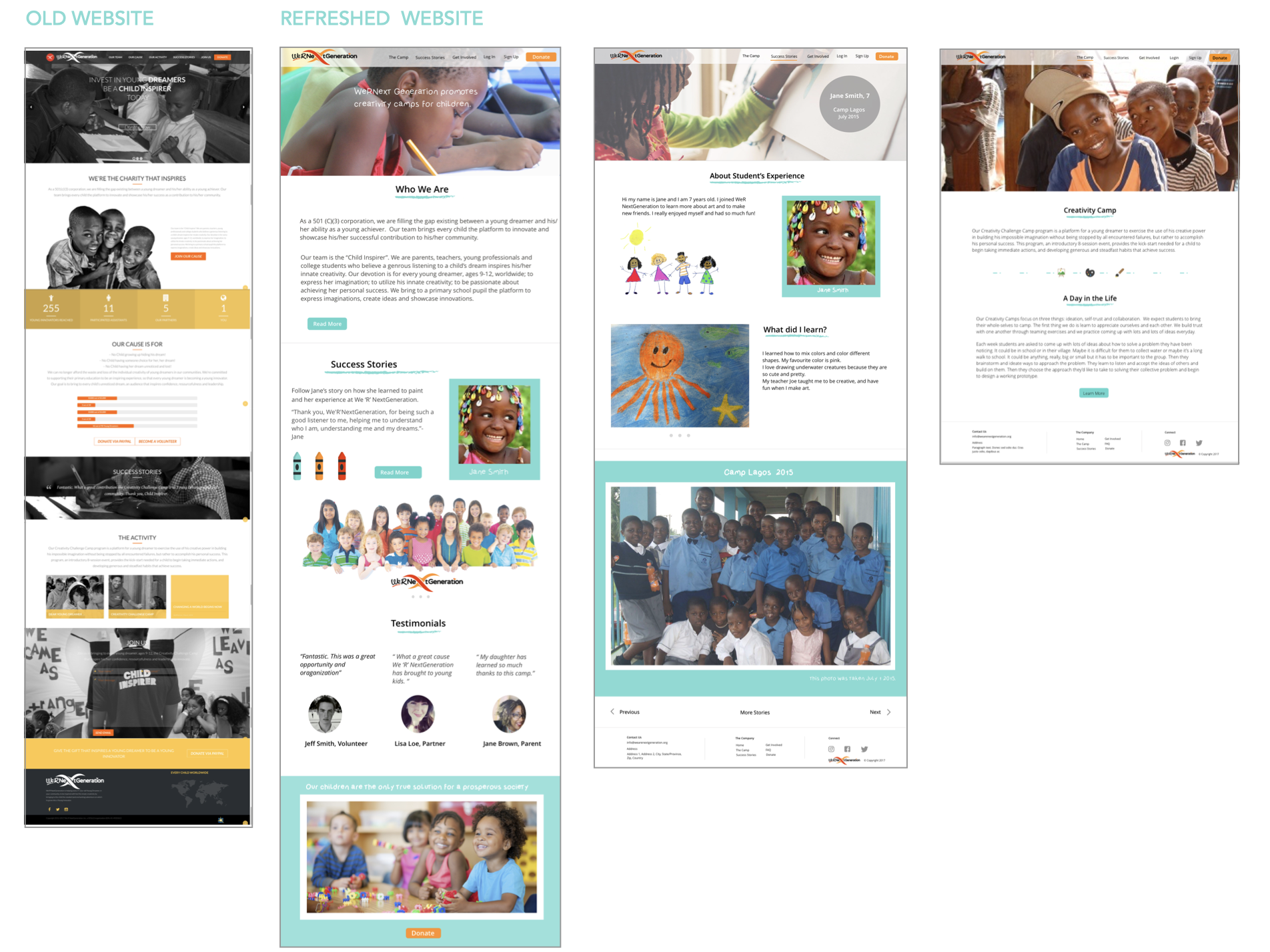
The old website was growing outdated and they needed the program and offerings to provide more functionality, so that they could mange the enrollment process more efficiently.
Their current site was only one page with a simple contact form at the bottom by which prospective parents (who would like to enrol their child for camp) could request information. They wanted to integrate the enrolment process into the site allowing parents, or even potential volunteers to apply online. They were also looking for a content management system by which they could process all of the applications through which they would be able to communicate with interested parties.

Research Methods
Tools Used: Google Survey, Heuristic Evaluation, Stakeholder Interviews
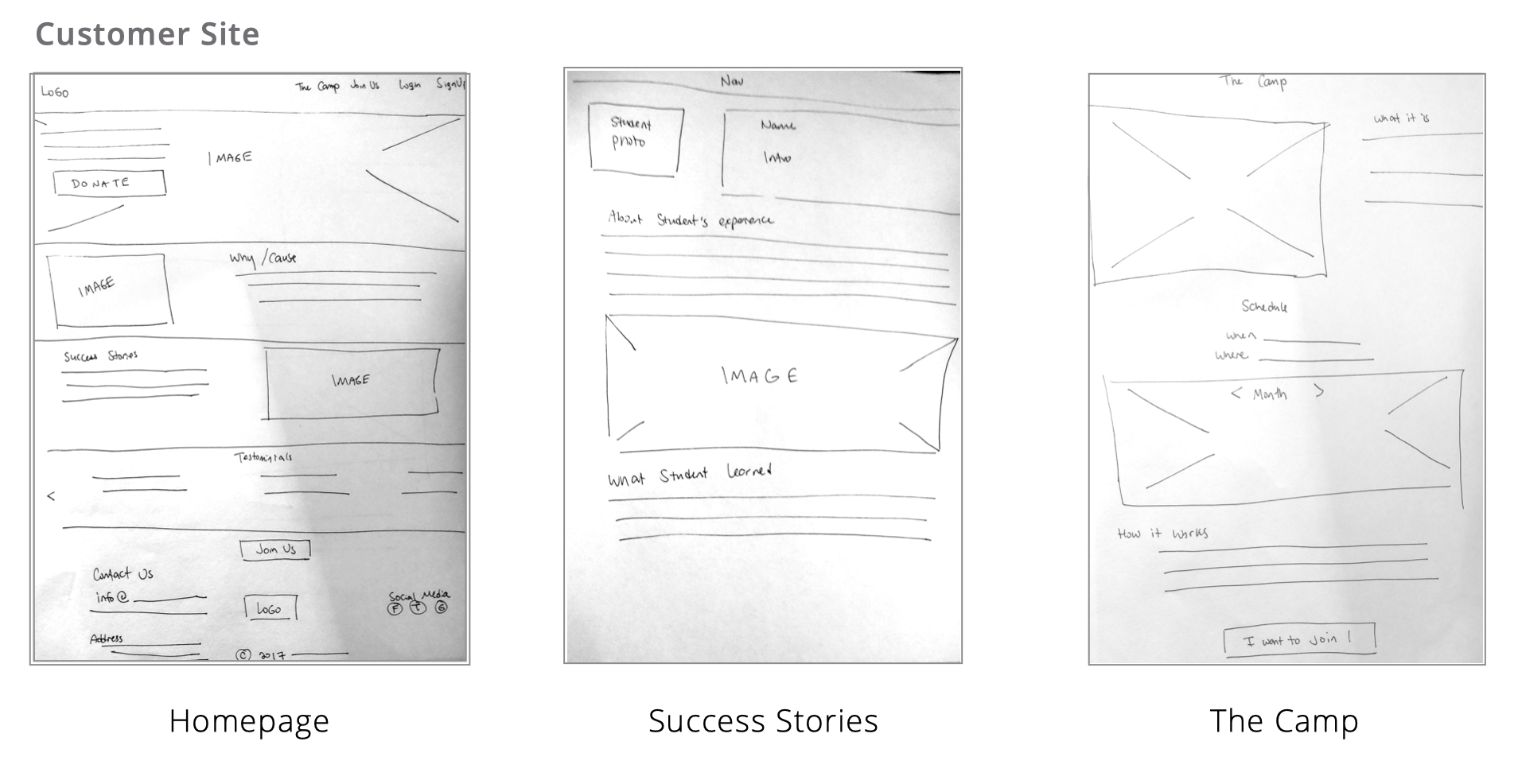
Customer Site
We started our research with a competitive analysis of the summer camp market which allowed us to get a feel for what’s working and not working for other founders on their sites. We followed it up with a heuristic analysis of the original site, making note of potential quick fixes as well as allowing us to gain an overall feel for the direction of the organization. Additionally, we designed a survey to see what would work best for parents enrolling their children in camp. We wanted to know how they preferred to communicate and what would make the enrolment process smoother for them. From this information we were able to ascertain user needs and develop potential personas.
Admin Site
While the front-end site was fairly straight forward, the admin-site took a little more research. We did several stakeholder interviews to nail down what they wanted as well as what makes sense from both a design and development standpoint. On the admin-site, we decided it was important to include: a record of all the members, email communication, a way to manage applications, and the ability to edit the front-end site.

The Solution
Methods Used: Stakeholder Interview, Survey, Brainstorm
Through several stakeholder interviews, the team was able to ascertain the direction the organization wanted to go. We had many brainstorm sessions and concluded for the main solutions to be:
Our Solutions
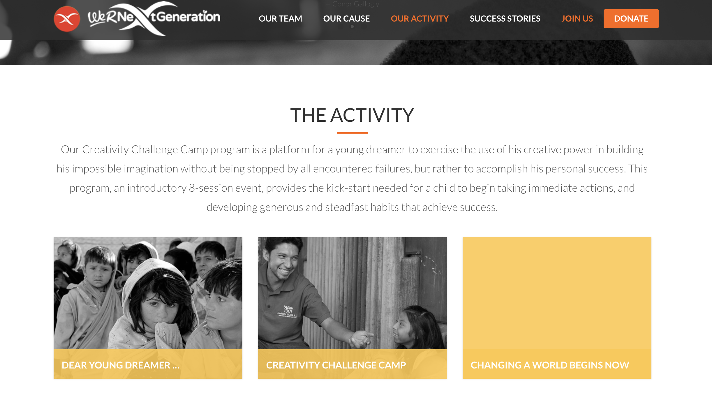
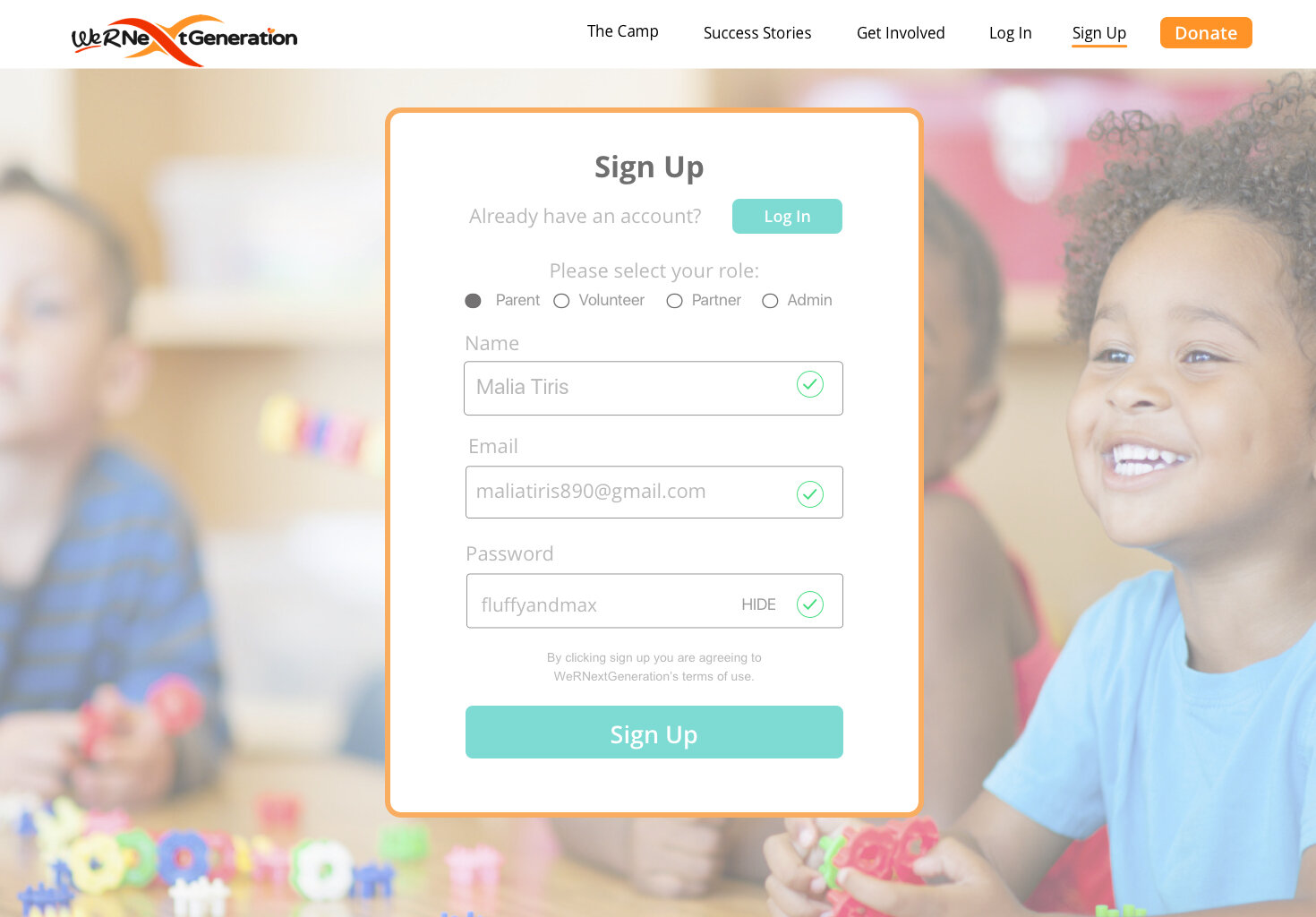
1. We expanded and re-designed the landing pages to include a member login where by parents (and volunteers) can create a profile and submit their applications online as well as monitor the progress of the a they submitted.
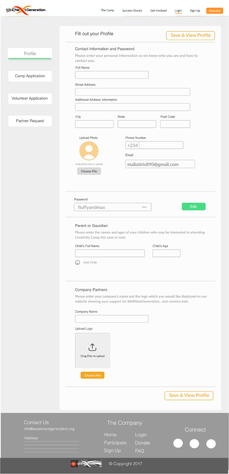
3. We also designed a secondary integrated admin site for processing the applications and communicating with the parents and volunteers. This is the final look of the admin panel, we have addressed this issue in the preliminary brainstorm and sketched out some mockups in the earlier stages.


Initial Sketches
Tools Used: Pen/Paper, Sharpie Pen, Adobe Scan


Wireframing and Layout Planning
We knew they wanted to keep it simple while expanding it. They also wanted a way to manage and process applications - the admin site. We needed to offer more information for parents an easier way for the to enrol their children in camp, as well as include space for children to share their creative experiences online.

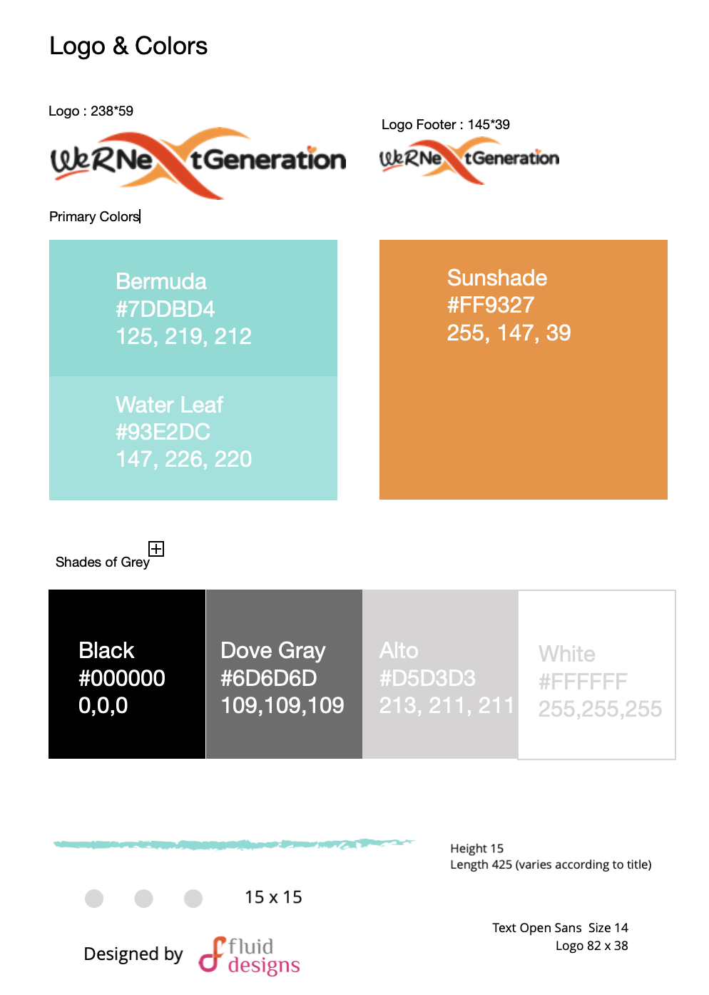
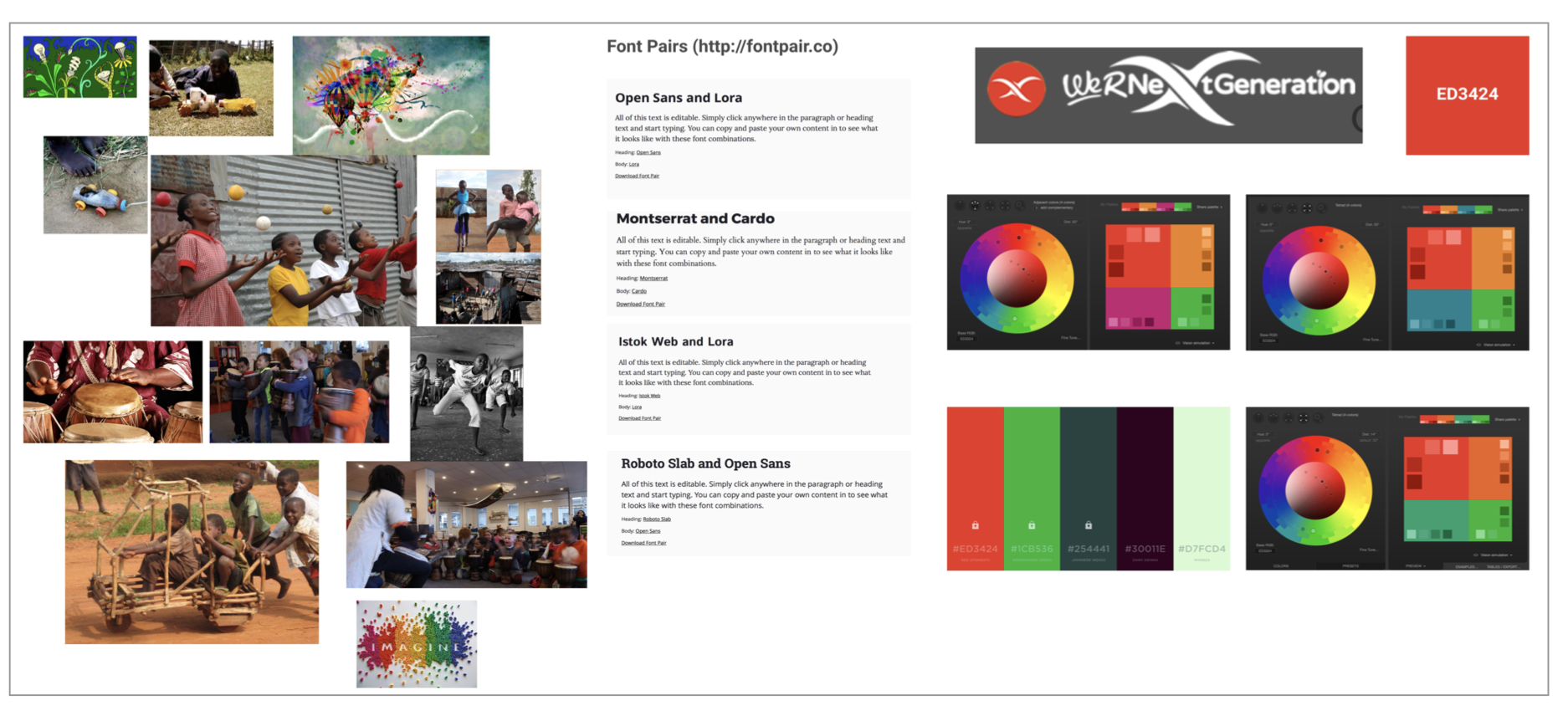
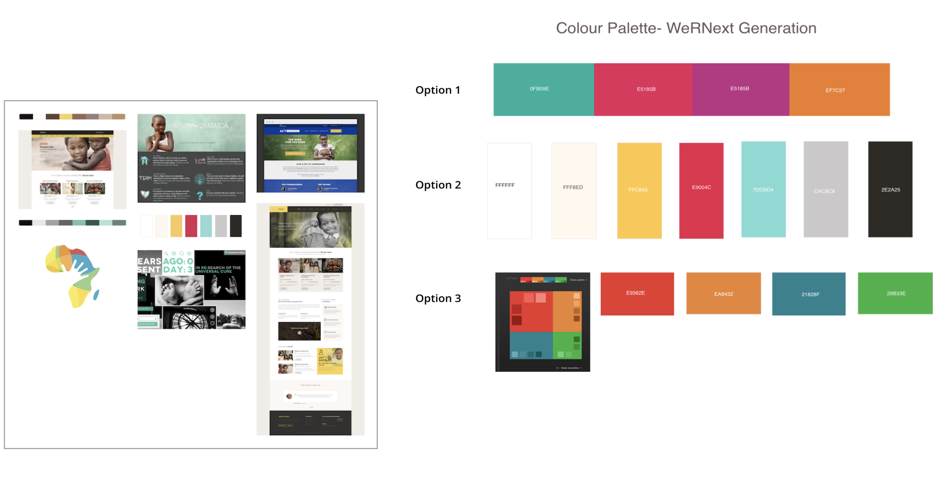
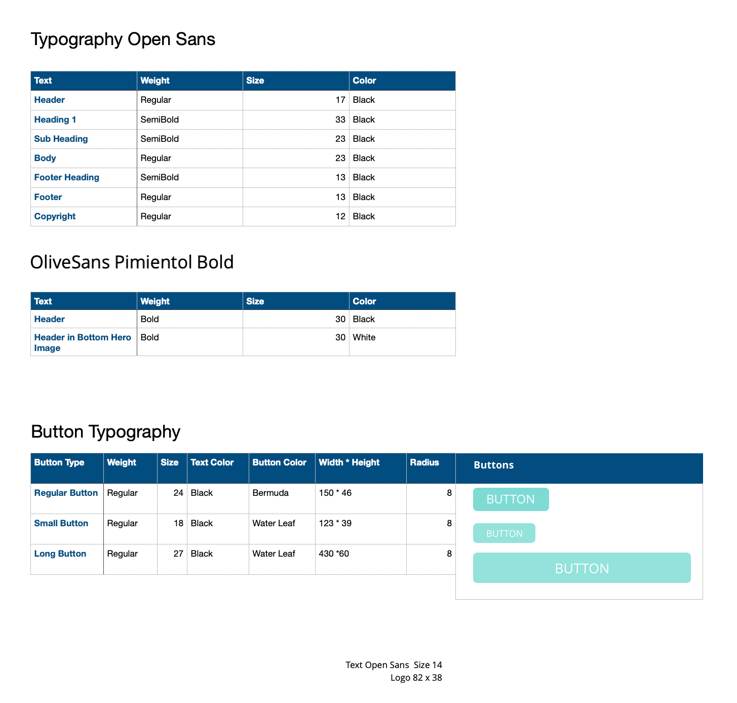
Branding Guidelines
Tools Used: Sketch, Google Drive, Abstract (for sharing Sketch files)
As the logo was already designed, we used it as a starting point for our visual design. We knew their main colours were two distinct shades of orange and that they wanted the site to be eye-catching and colourful, as well as to express the creativity that is at the heart their creativity camps. With this in mind, we carefully selected the fonts and colours as well as put together a style guide for the components we would use, to ensure cohesiveness across the site. Here we have the mood board to create the essence of the website, and the colour palettes options. On the last slide, we have finally agreed to have a light, refreshing colour palette based on look and feel of the direction we aspire to gear towards.

Visual Designs

Biggest Takeaways
- Learning to work remote and understanding that communication is especially key in this work environment
- Realizing that other designers have different strengths and weaknesses and helping each other in these areas are essential for a successful collaboration